
One of the central components of the FERC order 2023 is the creation of public-facing Points of Interconnection (POI) heatmaps, which visually represent transmission system capacity and interconnection availability.
A heatmap is a data visualization tool that helps developers identify suitable locations for new-generation projects and improves the transparency of the process.
In transmission planning, heatmaps visually represent the availability of interconnection capacity in MW on the grid; they show areas of high or low capacity for new-generation projects.
Heatmaps provide a quick, intuitive overview of grid conditions by helping to identify currently planned bottlenecks in the transmission system. They also allow stakeholders to assess potential interconnection points quickly based on color-coded capacity levels. Finally, heatmaps also display capacity constraints before and after a new input is injected with its number of MW.
Color-Coded Points Heatmaps
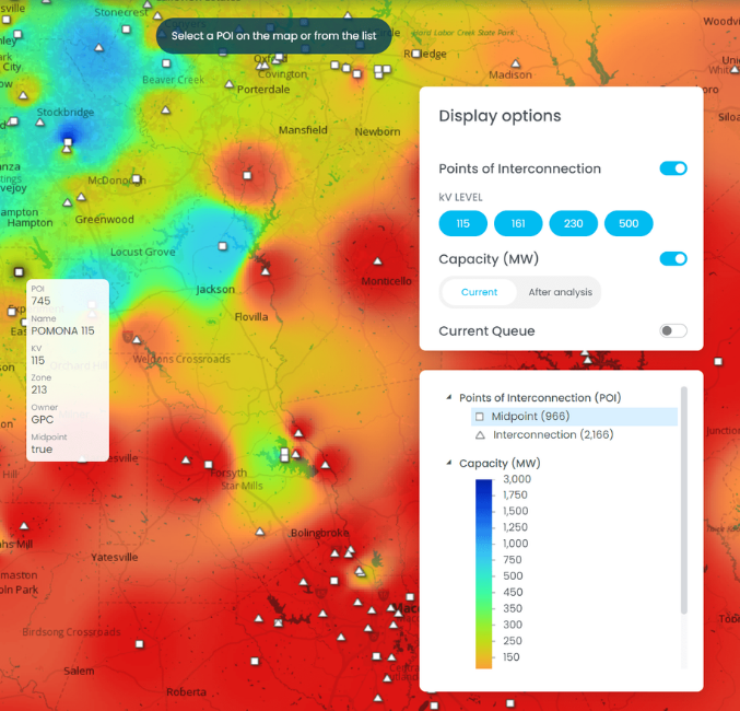
The first type of heatmap shows capacity information at specific points, such as substations or interconnection nodes.

The use case is to provide a detailed, localized view of interconnection potential. Users can quickly assess which substations have available capacity.
The problem with this sort of heatmap for capacity data is overlapping data.
When multiple voltage levels or many substations are located close together, overlapping points can make it difficult to interpret the data clearly.
This visual clutter can reduce the effectiveness of the map, especially in areas with a high density of substations or complex grid structures, which we refer to as 'congested areas '.
Color-Coded Transmission Line Heatmaps
The second type of heatmap is related to transmission line layers.
They show Capacity data along transmission lines, indicating the available capacity or congestion level across the grid.

This heatmap helps understand the stress or availability along specific transmission corridors.
However, the problem is that transmission line data is considered critical energy/electric infrastructure information (CEII), which makes it sensitive.
This data cannot be published on publicly accessible platforms without approval, limiting its use for wide-scale visualization.
These limitations make it challenging to share line-based heatmaps online freely, highlighting the complexities and sensitivities involved in energy infrastructure visualization.
They are better suited for internal analysis.
Interpolated (Raster) Heatmaps
Our last type of heatmap is for visualizing interpolated or raster values.
Interpolation is a method employed to estimate unknown values between specified data points. It produces a more comprehensive and continuous representation of capacity over an extensive geographic area.

It shows a more generalized, continuous capacity representation across a wide geographic area.
Interpolated heatmaps are ideal for providing broad, regional insights into available capacity zones and identifying optimal interconnection points.
Unlike point-based maps, raster heatmaps smoothly represent data across an area, avoiding issues with overlapping or crowded data points.
By interpolating data, raster heatmaps avoid revealing sensitive line-by-line capacity information, making them more suitable for public display without violating CEII rules.
Raster heatmaps, by far, provide a more intuitive, big-picture view, making it easier to identify regions with high or low capacity at a glance. They are the best option for large-scale capacity visualization, ensuring you have a comprehensive understanding of the grid's capacity distribution.
However, it's important to note that implementing raster heatmaps requires advanced mapping capabilities to effectively handle the 'interpolation' process, ensuring you are prepared for the technical aspects of this visualization method.
Key Takeaways
- FERC Order 2023's POI Heatmaps: A key element is the development of public-facing heatmaps to visually represent transmission system capacity and interconnection availability, aiding developers in identifying suitable locations for new-generation projects.
- Heatmaps in Transmission Planning: These maps offer a quick and intuitive overview of grid conditions by displaying capacity levels, potential bottlenecks, and constraints before and after injecting new generation capacity in MW.
- Color-Coded Points Heatmaps: Provide detailed views of interconnection potential at specific points, such as substations. However, overlapping data in congested areas can create visual clutter, reducing map clarity.
- Color-Coded Transmission Line Heatmaps: Show capacity data along transmission lines, but their use is limited by the sensitivity of critical energy infrastructure information (CEII), restricting public access and making them more suitable for internal analysis.
- Interpolated (Raster) Heatmaps: These provide a continuous, regional view of capacity, avoiding the clutter of point-based maps and being more suitable for public use without violating CEII rules. However, they require advanced mapping capabilities to manage the interpolation process effectively.
- Choosing the Right Heatmap: Each type of heatmap serves a different purpose—point maps for detailed, localized views, line maps for internal analysis, and raster maps for broad, public-facing capacity visualization—offering flexibility depending on the audience and sensitivity of the data.